By Kennedy Kirui |
With that done, we called it a day.
Tuesday 17th – Generating solutions
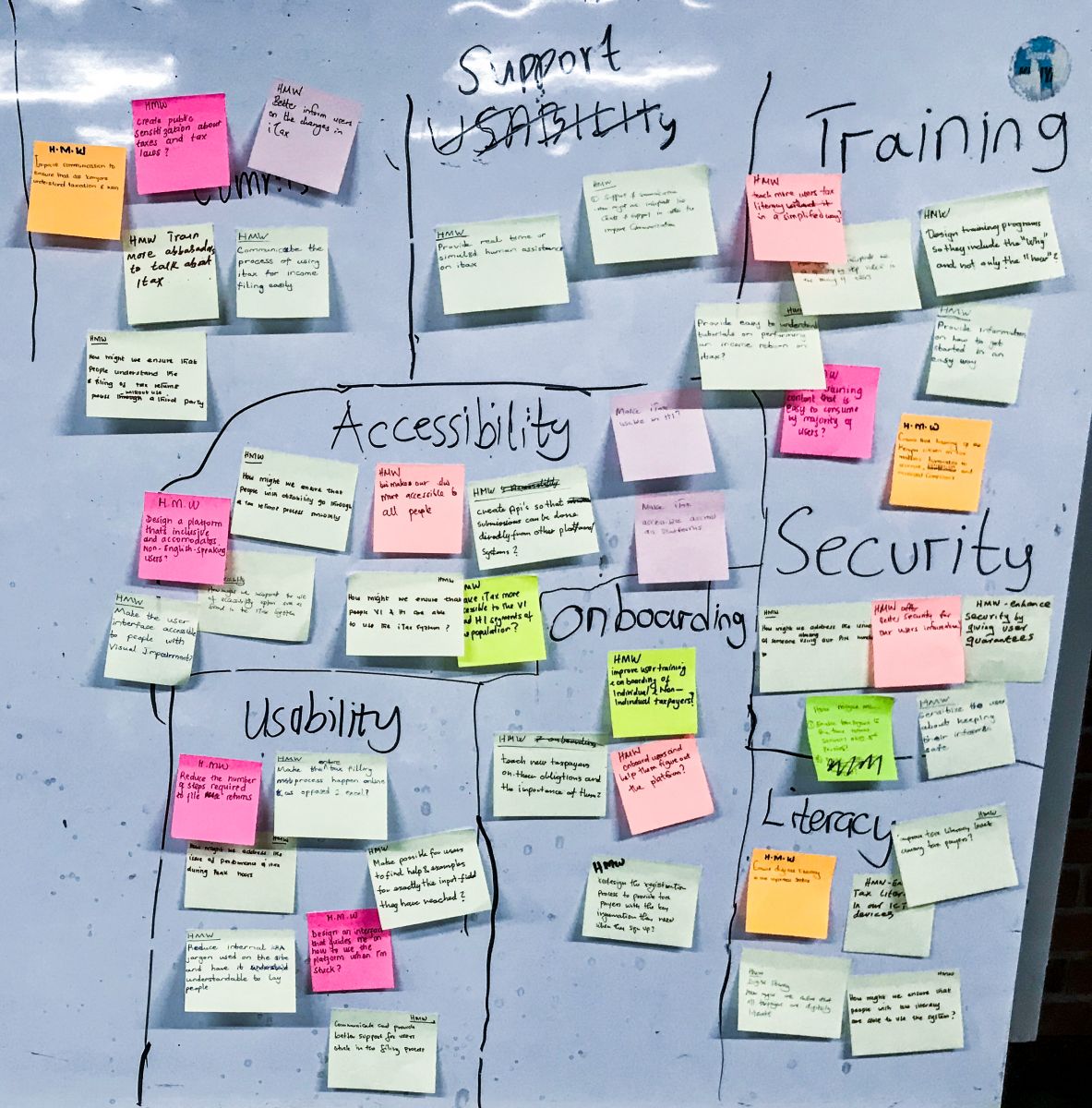
We kicked off the second day of the sprint by reviewing the activities from the previous day. From this, we quickly realized we couldn’t solve the four problems we had identified during the sprint. The first exercise was to decide on the challenge to focus on for the remainder of the sprint. Using the voting dots, each participant selected a challenge they felt if solved would have the most impact. With just one voting round, we identified iTax’s usability as an issue that would be tackled during the sprint.
The next exercise was what is referred to as “remix and improve”. Participants were tasked with identifying similar solutions or solutions playing in the governance space that they liked and pinpoint ideas we could borrow from such solutions. This allowed us to leverage on existing efforts that have shown to work well.
Seeing that our focus was going to be on iTax’s usability, one of the KRA team members took us through the tax filing process.

As the walkthrough was being done, one of the participants mapped the steps taken to file income tax. The rest of the participants were armed with a pen and stickies noting any kinks or confusing elements of the journey. At the end of the walkthrough, we quickly reviewed our findings.
Armed with this information, the participants were now ready to start sketching possible solutions. To ease ourselves into the exercise, we first started by highlighting the proposed workflow in writing. This was done individually and all ideas were pinned on the board and reviewed. Next, the participants generated different ideas on how a taxpayer would navigate iTax. This included what they would see when they first landed on the site, what they saw on login, and the filing process.
At the end of the day, we had a stack of different ideas. We then broke for the day.
Wednesday 18th – Storyboarding
Wednesday morning kicked off with a quick review of the sketches from the previous day. The exercise was aimed at identifying the most interesting approaches the participants identified. We quickly realized we couldn’t rework the entire website and as a result, we had to converge again. At the end of the exercise, we had selected reworking the landing page, the dashboard the user sees on login, and the income tax filing process. Income tax is what taxpayers who are employed file.
For the rest of the day, the team split into three separate groups. For the first half of the day, the groups worked on different solutions for the same screens. At intervals of 20 minutes, they shared what they had allowing for cross-pollination of ideas.

Early in the afternoon, for about 15 minutes, we switched gears and worked on a marketing message for the prototype we were going to test at the end of the week. This exercise helped us think even more about what would catch the taxpayers’ eye. It would also act as a guide for the team on what was expected at the end of the sprint. After reviewing the ideas on the board, a couple quite cheesy, we unanimously chose “File your taxes in three easy steps” as our slogan. The implication was that we had to ensure a taxpayer could file their income taxes in only three screens and still provide all the required information.
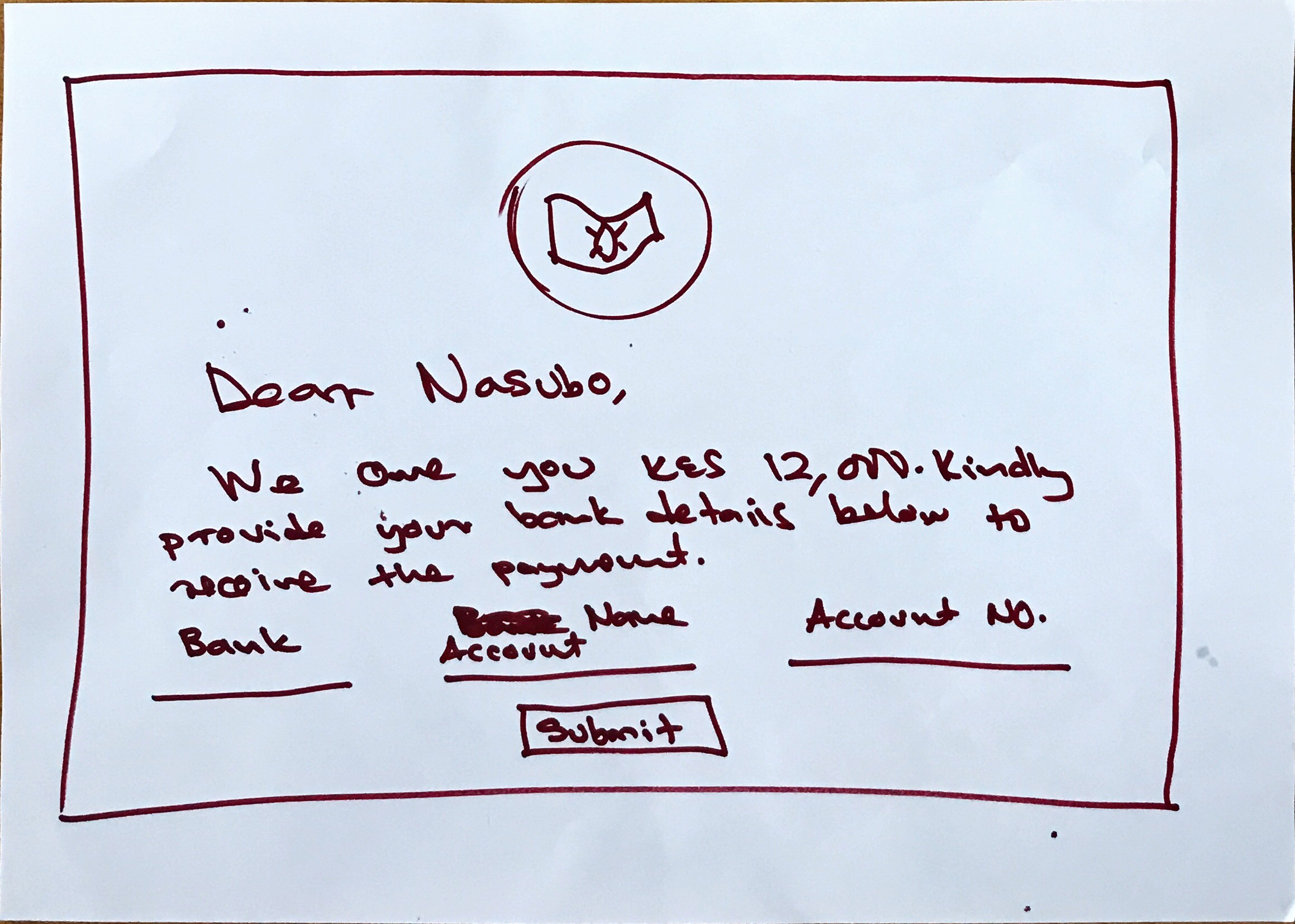
After several iterations, we finally had the storyboards we needed.


Once a user selected to file income tax, the process looked as follows:


Thursday 19th – Prototyping
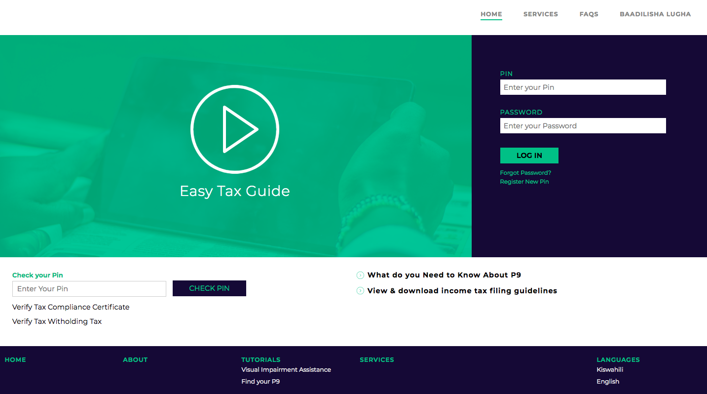
The fourth day of the sprint is when we finally get to build something. For the designers and the developers in the team, this is usually the most challenging day. Compared with the other days, it feels like a silent day. However, that is never the case. Building a prototype in a single day is no mean fit. Luckily, the iHub Software Consulting team were up to the task and managed to build the prototype just in a single day. At the end of the day we had:
- A redesigned home page
- A new dashboard for logged in users
- A process for filing income tax

Friday 20th – User testing
On Friday, we finally got the chance to put what we had worked on all week in front of users and get feedback. The test sought to understand the following:
- Understand the challenges our testers face using iTax
- Get reactions to the new visual design
- Get reactions to the new dashboard for logged in users
- Test the three-step filing process
- Get feedback on areas for improvement

We tested the prototype with six different participants. You can check what we tested by going tohttps://easytax.ihub.co.ke/. Please note that it is rough around the edges
From the test, participants identified the following as things they liked:
- The video tutorial on the landing page provided guidance on taxes
- The interface was deemed clean and straight to the point
- The messaging was simpler and easier to understand
- Multi-lingual support
- Straightforward navigation
- The use of icons helped communicate well
- The 3-step filing process
- The breakdown of tax obligations
- The tax calculator
The areas for improvement identified were as follows:
- How a taxpayer’s PAYE was calculated could be improved. A couple of participants didn’t understand how the math was done
- Tax balance was didn’t communicate. A couple of users didn’t understand if they owed KRA or KRA owed them
- The new flow didn’t explain the impact having a mortgage or life insurance had on their tax obligations
- The messaging could be improved further
- No one thought there was a person behind the live chat feature 🙁
What next?
The iHub Software Consulting team will spend the next two weeks refining the prototype based on the feedback received from the testers. We will then release a more complete version of how a tax filing platform would look like if it was designed with the user at the center.
